Project 5
Objectives:
1. Take photos of flowering trees.
2. Adjust the contrast, tone, and saturation of the photographs.
2. Adjust the contrast, tone, and saturation of the photographs.
Research:
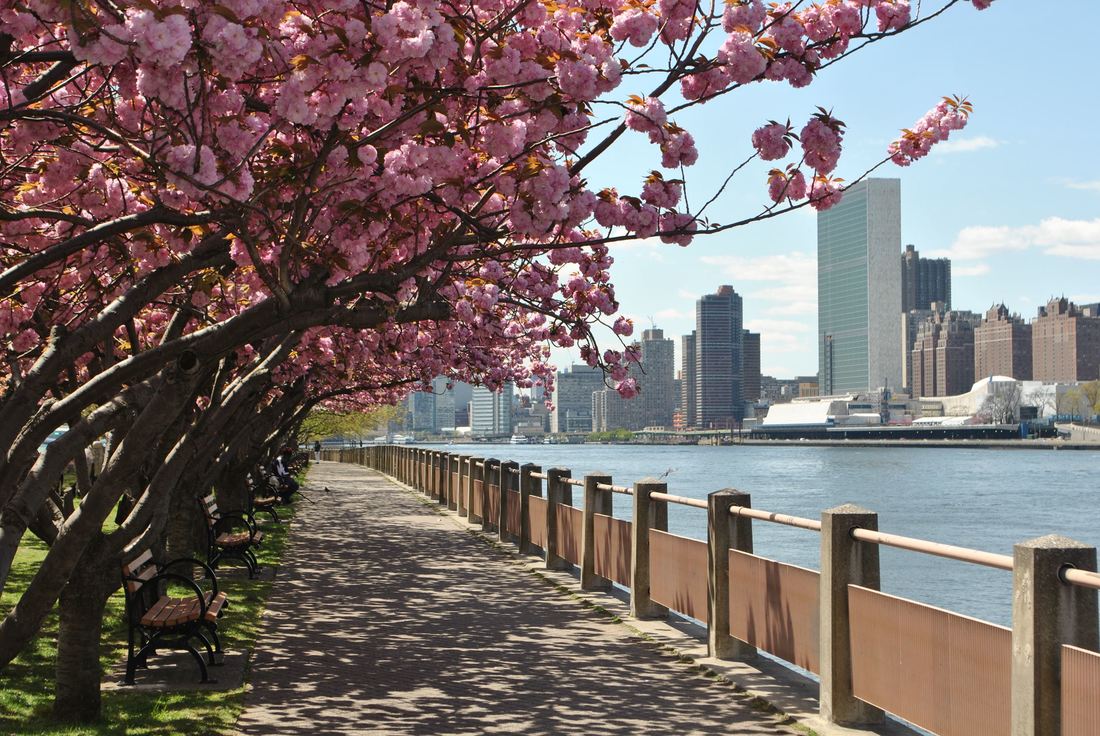
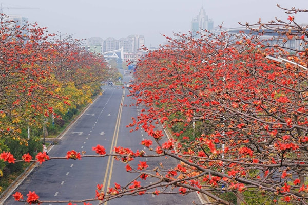
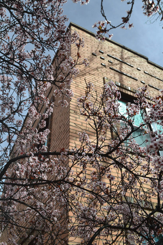
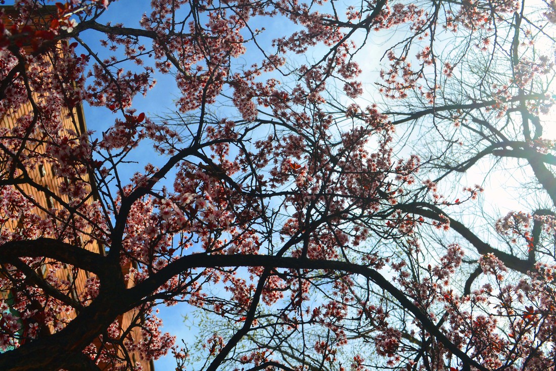
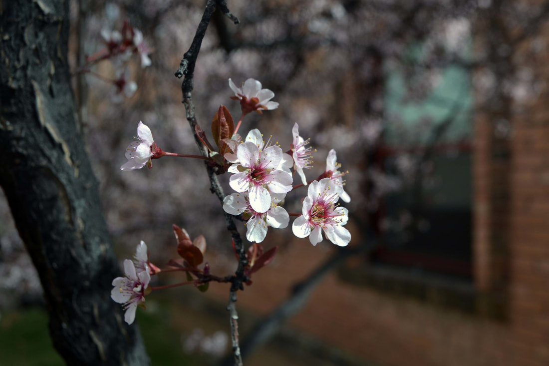
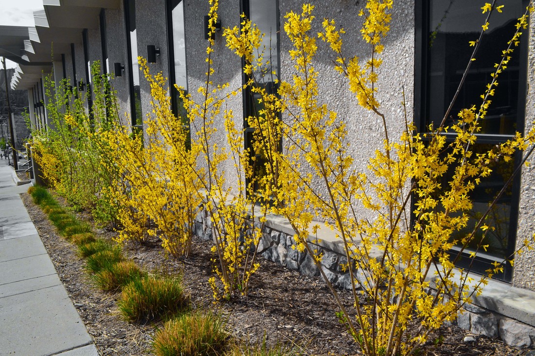
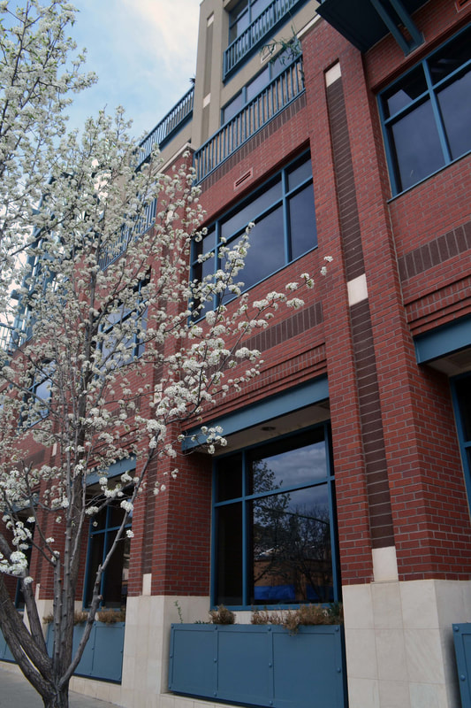
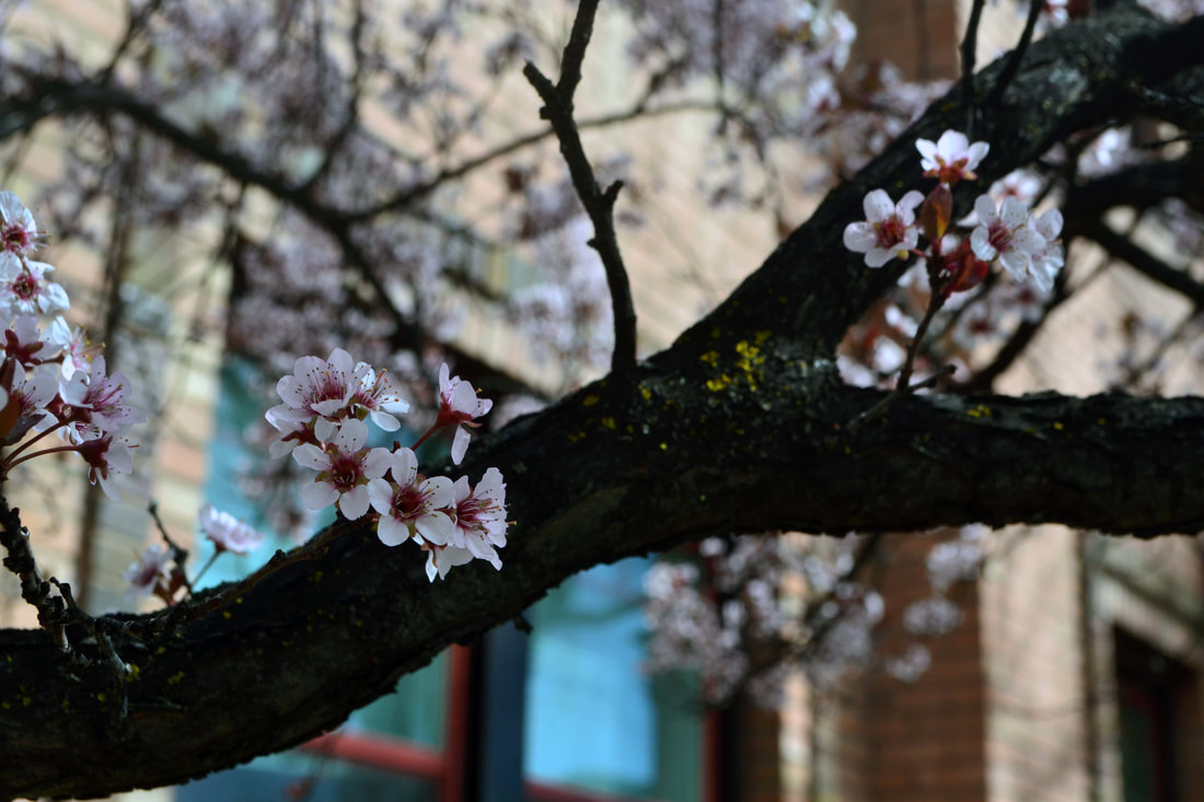
I like how vibrant the colors are in these photographs. I also like the look of the natural trees next to man-made buildings.
|

|
|
Raw Photos:
I took these photos downtown in Durango. I was looking for different colors of flowering trees.
Edits:
I edited these photos in a variety of ways. I mostly used image adjustments to adjust the tone, contrast and colors. For some, I edited in black and white.
|
|
|

|
Final Print:

Critique:
OBSERVE + DESCRIBE:
This is two photographs of flowering trees. The photos are in black and white with a black mat board around them.
ANALYZE:
In this photograph, there is a connection between the Element of Art 'Value' and the Principle of Design 'Contrast.' This connection can be seen in the tree branches. Since the photos are in black and white, there are many different values of grey, black, and white. The branches are a darker black value, where the rest of the picture contains a lot of lighter values. These opposite values contrast each other in the photograph. Another connection can be made between the Element of Art 'Color' and the Principle of Design 'Emphasis.' The dark colors create a strong emphasis on the areas that have are darker, like the tree branches. The flowers are also emphasized because the colors are lighter and some are white.
INTERPRET:
The idea for these photographs was to take pictures of the flowering trees. Also, some of the pictures include buildings in them. The purpose of having the buildings is to combine the natural world and aspects with the man-made structures.
EVALUATE:
I think that this project turned out good. I still feel like I can produce better work, and I want to push myself more. I like how I combined the idea of the flower trees with buildings.
