Project 4
Objectives:
1. I will take photos of a combination of two objects that don't usually go together.
2. I will edit the photos using image adjustments.
2. I will edit the photos using image adjustments.
Research:
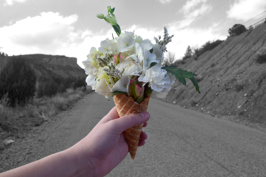
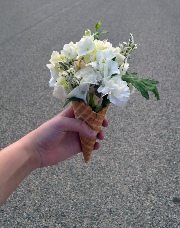
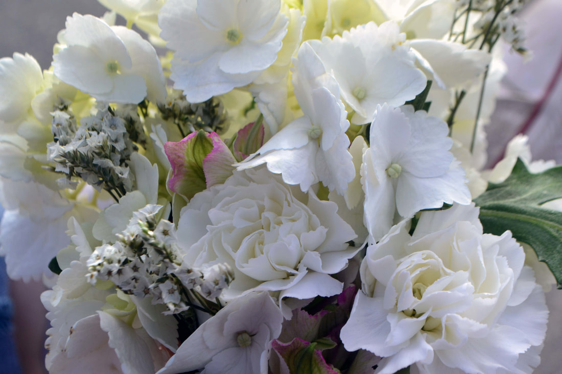
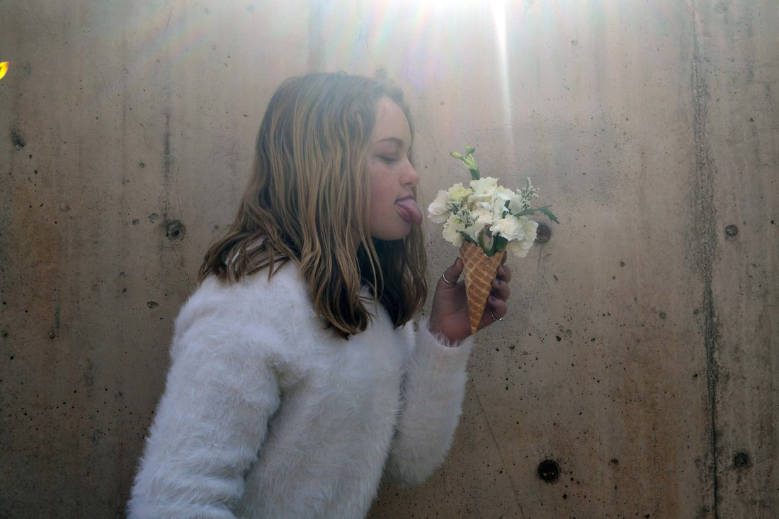
I like that the colors in these photos are very lively and bright. I also like how the flowers are in ice cream cones instead of ice cream.

|

|

|
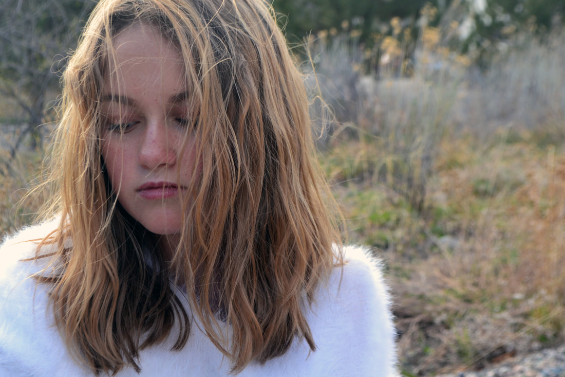
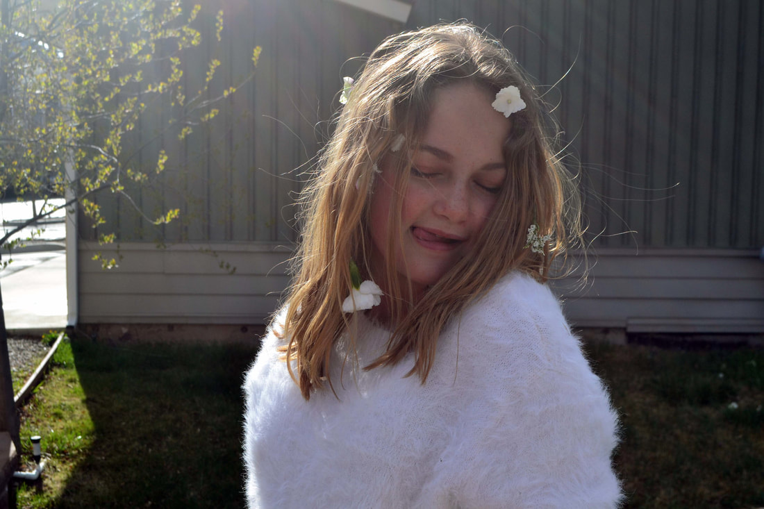
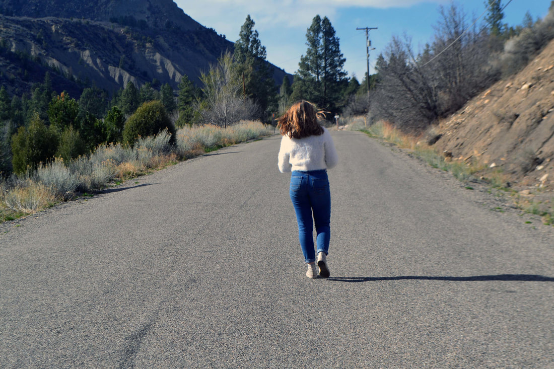
Raw Photos:
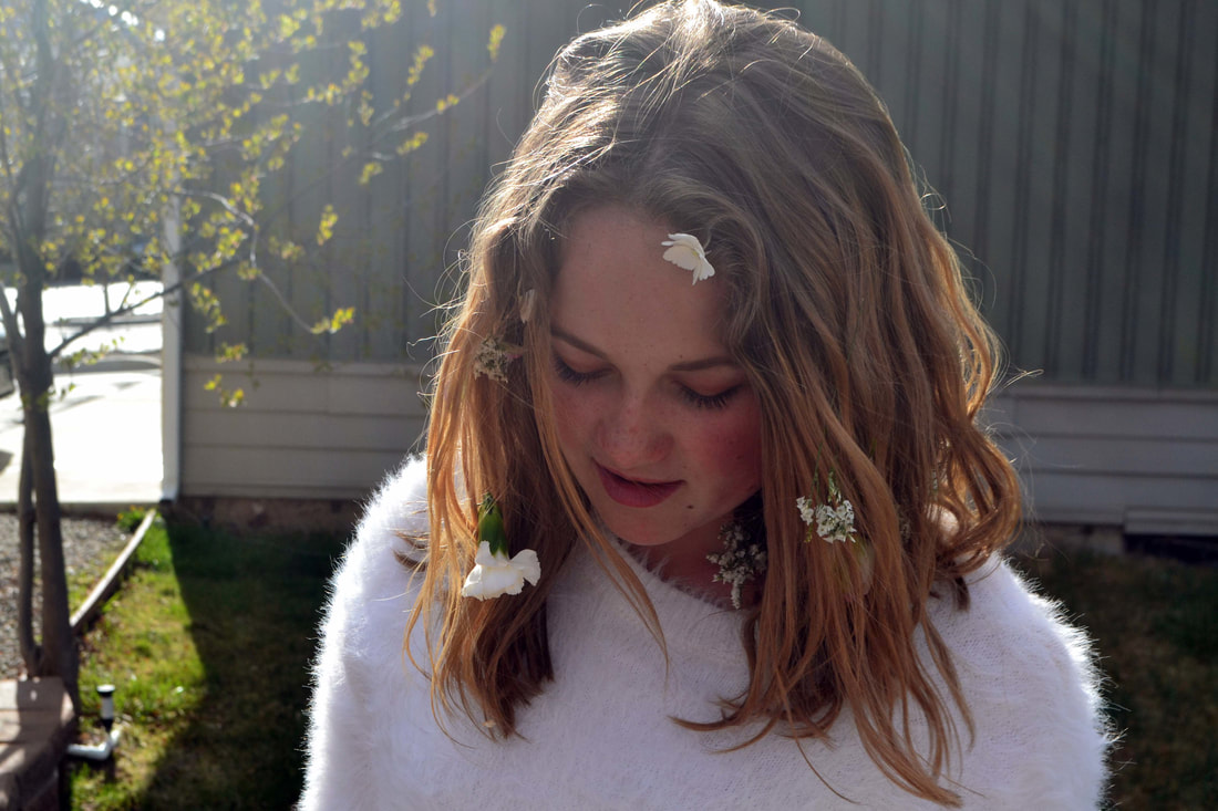
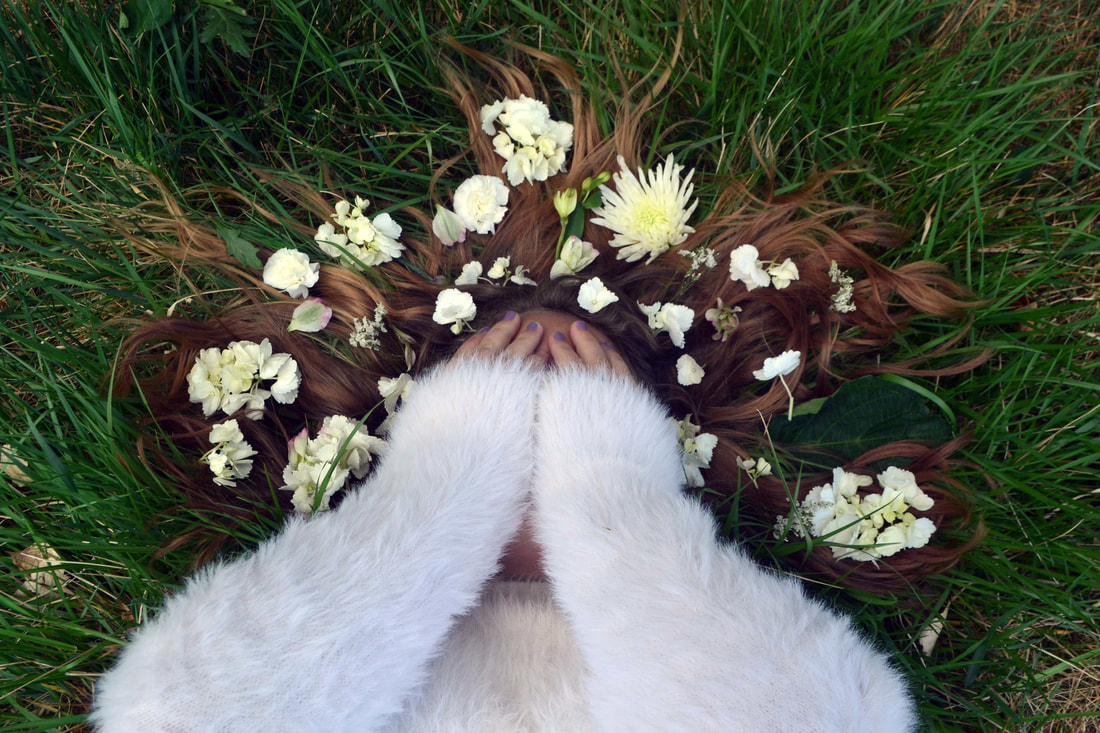
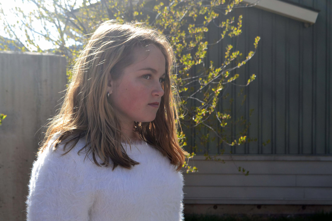
I shot these photos in the late afternoon, so I feel like in some parts the lighting isn't great, and also the backgrounds weren't as good as I hoped they would be, but I had to try to work with what I have access to.
Edits:
I edited these photos all in different ways. I mostly used image adjustments to spot color, or alter the contrast, saturation, tone, etc.


|
|
Final Print:

Critique:
OBSERVE + DESCRIBE:
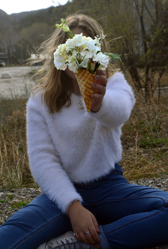
This is a photograph of my sister holding an ice cream cone full of flowers in front of her face. She is wearing a white sweater and blue jeans. There are trees in the background.
ANALYZE:
In this photograph, there is a connection between the Element of Art 'Shape' and the Principle of Design 'Emphasis.' This can be seen in the ice cream cone that is in the center of the photo. The ice cream cone is covering her face and interrupts the shape by breaking up the lines with the sharp angles of the cone and soft white flowers. Another connection can be made between the Element of Art 'Color' and the Principle of Design 'Unity.' The green color of the leaves in the flowers in the foreground create unity with the green shades and colors of the trees in the background. The color green connects the background and foreground, while unifying the photograph with a similar color.
INTERPRET:
The idea for this photograph was to combine two things with each other that don't normally go together (ice cream cones and flowers). I think that I accomplished this because I used those elements and incorporated them into my photographs.
EVALUATE:
I like how my pictures turned out overall. The lighting at the time wasn't ideal, which I don't think helped the photographs. It was windy outside, which I think helped the photos so that the person's hair blew around instead of just hanging down.
